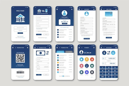
Creating an effective app design is essential in today’s digital landscape, as more and more people are relying on the convenience of their devices to access the online world. With that in mind, staying up to date on the latest app design trends is key to staying ahead of the competition. From the use of bright colors to attractive illustrations, this article will discuss the top 5 app design trends that you need to know about in order to stay one step ahead of the curve. By understanding the most popular trends, you will be able to create an app design that is both eye-catching and user-friendly. So, if you want to ensure your app stands out from the rest, then read on to learn about the top 5 sophisticated app design trends that you need to be aware of.
Bright Colors
One of the most noticeable trends in app design is the use of bright, bold colors. This is perhaps due to the fact that colored apps tend to stand out from the crowd, which is important in an industry where users are likely to have several apps on their devices. When designing your app, consider using both primary and secondary colors to add visual appeal and make your app more memorable. While it’s important to use a range of different colors, using too many can make your app seem cluttered, so try to use a maximum of three.
A good rule of thumb is to base your color choices around your app’s theme or the brand that you are trying to promote. For example, if you are designing an app for an outdoor sports brand, then you may want to consider using bold green, blue and yellow colors. If you are designing a children’s app, on the other hand, you may want to go for more pastel shades.
Interactive Design
As the name suggests, this refers to the inclusion of interactive elements in your app’s design, such as embedded videos, animations, or sound effects. Interactivity is a great way to engage users and is likely to increase their overall satisfaction and retention of your app.
When planning your interactive elements, make sure that they fit within the design of your app. For example, if you are designing a news app, then an interactive news ticker might work well. Whatever interactive elements you decide to include, make sure that they are relevant to your app’s subject matter.
Next, you should also consider how to best implement these elements. This might involve adding a button that triggers the interaction or including a swipe feature that allows users to trigger the interaction themselves. Whatever you decide, make sure that the interaction is easy to use and that it doesn’t take away from the design of your app too much. Your interactive elements should enhance your app’s design, not overpower it.
Responsive Design
Another important app design trend that you need to be aware of is responsive design. This refers to the fact that your app’s design should respond to the device that it’s being viewed on. In other words, your app should look great on all types of devices, from desktop computers to smartphones. When designing your app, you should keep this in mind and make sure that your design can be easily adjusted to fit different screen sizes.
One way to do this is by adjusting the font size in your app’s copy. If you want your app to be used on a variety of devices, then it’s essential that you design your app with responsive design in mind. If your app looks great on desktop computers but is difficult to use on smartphones, then you are likely to turn away many potential users.
Illustrations
Like the previous trends, there are various reasons why app designers are choosing illustrations over photos these days. Firstly, illustrations are usually less expensive than photos, which means that designers can use fewer images and still create an interesting design. Secondly, illustrations can be easily edited to change a design or to reflect a holiday or seasonal event, whereas changing a photo can be more challenging.
When planning your illustrations, make sure that you choose images that are relevant to your app’s subject matter. For example, if you are designing an app for a sports brand, then you may want to consider using sports-related illustrations. Whatever you decide, make sure that the illustrations are relevant and interesting. Your illustrations should also be tasteful, and avoid any images that may be considered offensive or controversial.
Minimalist Design
Many designers are opting for a clean and uncluttered app design rather than a more complex approach. As you may expect, minimalist design usually features a clean, white background, and simple, easy-to-read fonts, along with a general lack of imagery.
There are a number of reasons why designers choose the minimalist design. Firstly, it is clean and easy to use, which means that it is likely to appeal to a wide variety of users. Next, minimalist design can be easily edited to reflect seasonal or holiday events, which means that you can keep your app visually fresh without having to use many images. Whatever app design trend you choose, make sure that it reflects your brand’s personality and is easy to use. Don’t over-complicate your design; instead, keep it clean and uncluttered, and your users are sure to appreciate it.
Conclusion
There are many different app design trends that you need to be aware of as a designer. From bright colors to interactive elements, each trend has its own benefits and can help to improve your app’s design. By learning about these trends, you can create an app that not only looks great but is easy to use as well.
